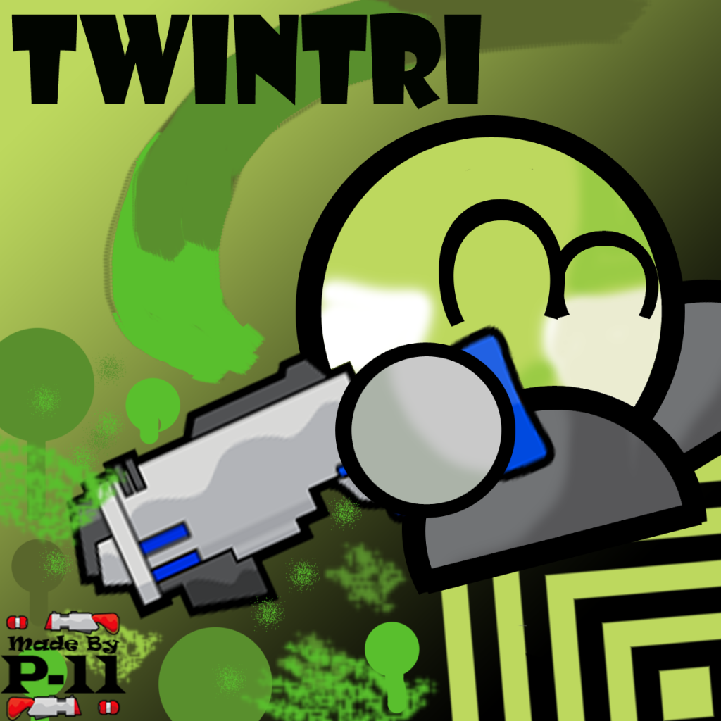
First u should learn the basics. There are A LOT of good and free tutorials, guides etc.
U also have to learn how to place something and which colors u use etc.
E.g. the yellow text doesnt fit with the black background, there is too less space on the borders and too much free space on the bottom. The font doesnt fit with the logo of the left one.
So u could try to use lighter colors, to improve the properties of the text and the pictures. Add some smaller details in the background but NOT too much and also dont use pictures with a low resolution and scale it up 
May advice would be to check out some pictures of some well known artists or also maybe from online communities like behance.net or deviantart.com and analyse their composition. It helps u to get a feeling how to place different elements on picture.


