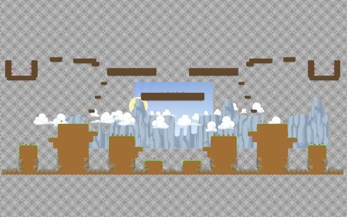
Topic: [MAP]K.O.hills
Here is a DM map made for the "Super Smash Bros" mod, but it also works with plane dm...
Description: A medium sized, Grassy, map.
Game type: DM
Version: 0.5.1
Download link: Click me!
Screen shot:
You are not logged in. Please login or register.
Teeworlds Forum → Maps → [MAP]K.O.hills
Here is a DM map made for the "Super Smash Bros" mod, but it also works with plane dm...
Description: A medium sized, Grassy, map.
Game type: DM
Version: 0.5.1
Download link: Click me!
Screen shot:
In all honesty Bee, it's not that great. The overall shape of the map is pretty blah, and overall, it's boring.
In all honesty Bee, it's not that great. The overall shape of the map is pretty blah, and overall, it's boring.
I'm not sure if you know that much about editor, or how a map actually looks like once you play it, or how much boringer it can get. 
But you are entitled to your opinion.
So, what do you think can make it better?
Hmm i have experience with the map editor and i have to say its a bit boring... theres no extra things all the ledges are just standing next to eachother. And why are u so obsessed with spikes??
Gentlemen wrote:In all honesty Bee, it's not that great. The overall shape of the map is pretty blah, and overall, it's boring.
I'm not sure if you know that much about editor, or how a map actually looks like once you play it, or how much boringer it can get.
But you are entitled to your opinion.
So, what do you think can make it better?
I'm well aware of the above.
Well, the shape of some platforms are completely square for starters, which just makes it look like crap. Try mixing the shape up a bit, trying to make it look a little more "natural".
Hmm i have experience with the map editor and i have to say its a bit boring... theres no extra things all the ledges are just standing next to eachother. And why are u so obsessed with spikes??
I have to admit, it is boring for just dm.
But I originally made it for a mod, that is why it is, how it is... kinda
|X-treme|Bee wrote:Gentlemen wrote:In all honesty Bee, it's not that great. The overall shape of the map is pretty blah, and overall, it's boring.
I'm not sure if you know that much about editor, or how a map actually looks like once you play it, or how much boringer it can get.
But you are entitled to your opinion.
So, what do you think can make it better?
I'm well aware of the above.
Well, the shape of some platforms are completely square for starters, which just makes it look like crap. Try mixing the shape up a bit, trying to make it look a little more "natural".
Hum... okay.
Thanks. :]
Teeworlds Forum → Maps → [MAP]K.O.hills
Powered by PunBB, supported by Informer Technologies, Inc.
Currently installed 3 official extensions. Copyright © 2003–2009 PunBB.