Topic: [MAP] Caverns
This is a dark map with many layers, its a somewhat long map with not too much height.
Tee_Shirt_Caverns.map
This link is newest one yet, old screenshots have been removed.
You are not logged in. Please login or register.
Teeworlds Forum → Maps → [MAP] Caverns
This is a dark map with many layers, its a somewhat long map with not too much height.
Tee_Shirt_Caverns.map
This link is newest one yet, old screenshots have been removed.
Oh the tiling! It burns my eyes!
thats bad very bad look what u tiled  u have to do it better much better
then it look like a good map
Yea I know, its just the corners aren't sharp enough, I wanted them shaper! but they aren't. I guess I will redo it and make it fully rounded. What do you think of the map Idea though? I made each layer back 20% smaller and set the para X & Y exactly right, its fun to just move it around in the editor.
ok, the tyling rly sucks, change it!!
but the gaming of this map looks not bad 
Ok I have completely redone the map! It has so many layers you cannot change options of last group without moving it up temporarily xD
I also added some envelopes, redid the 'shading'. Its awesome!
"This is not a map! This is artwork! " If you thought that was artwork check it out now!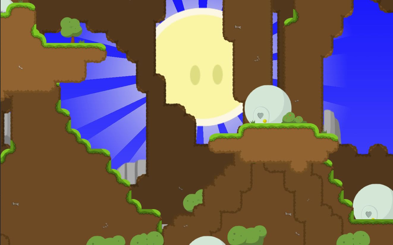
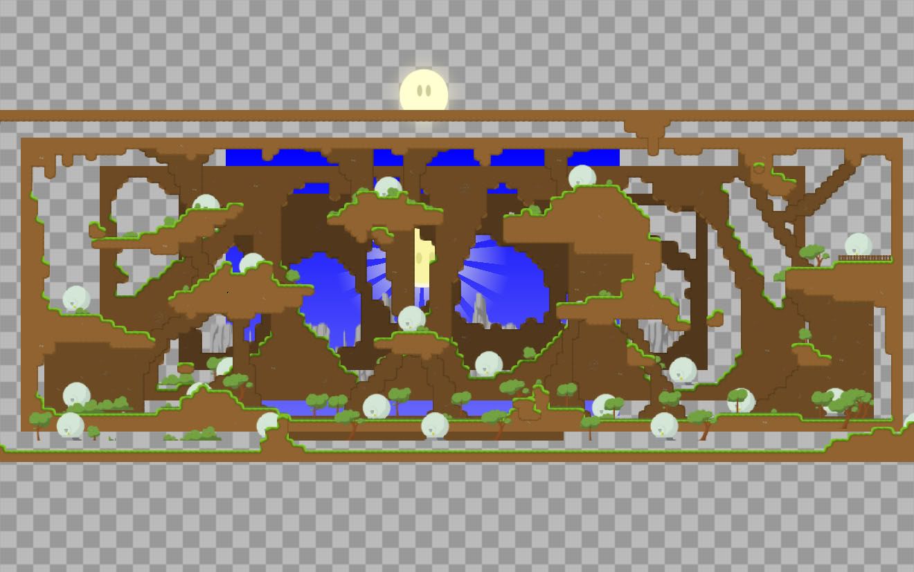
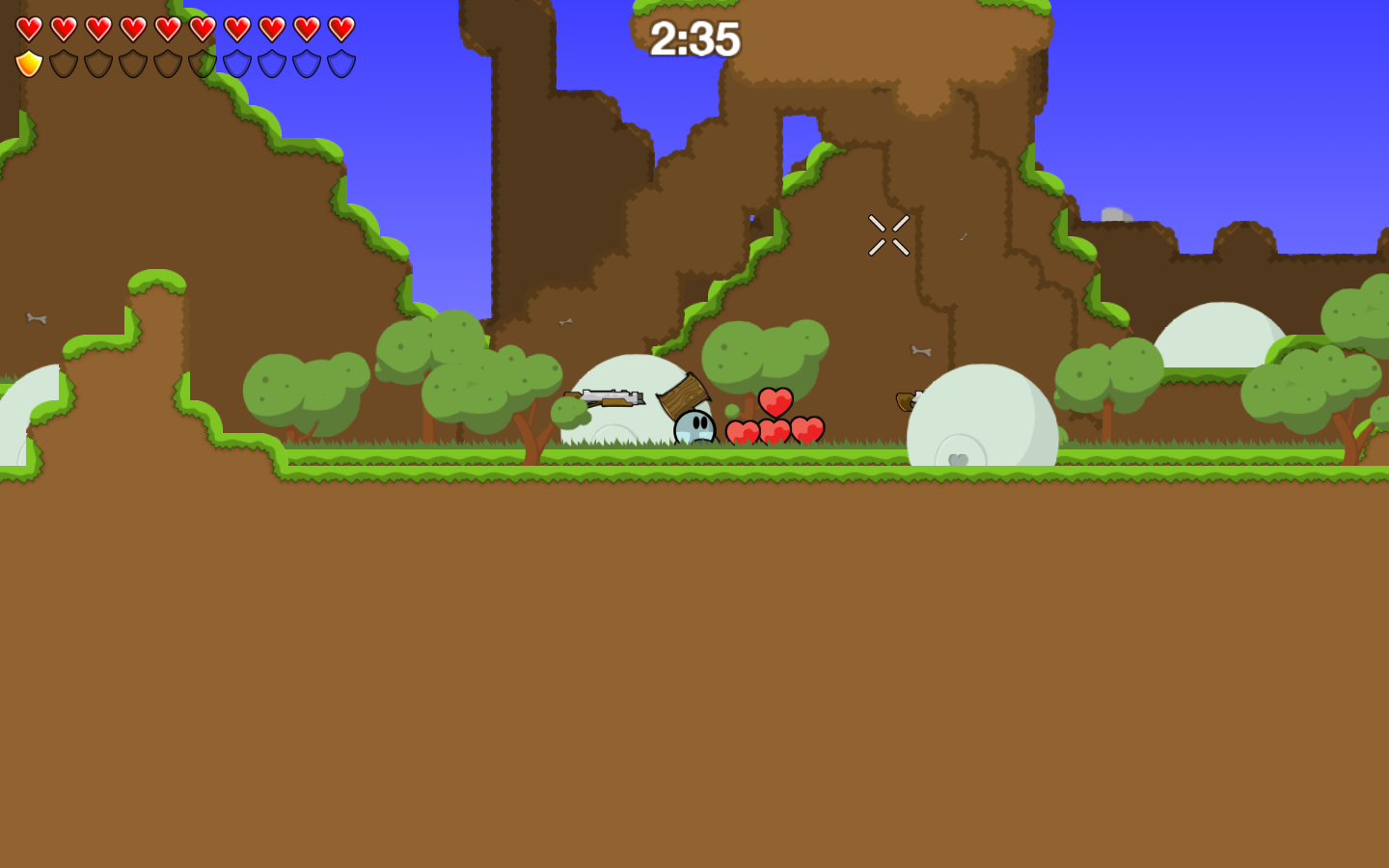
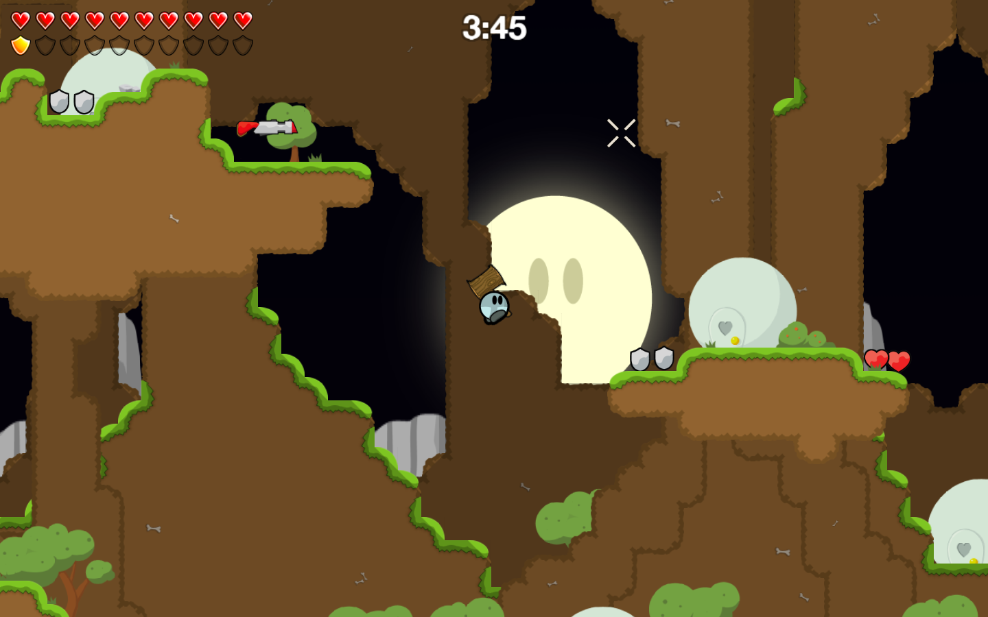
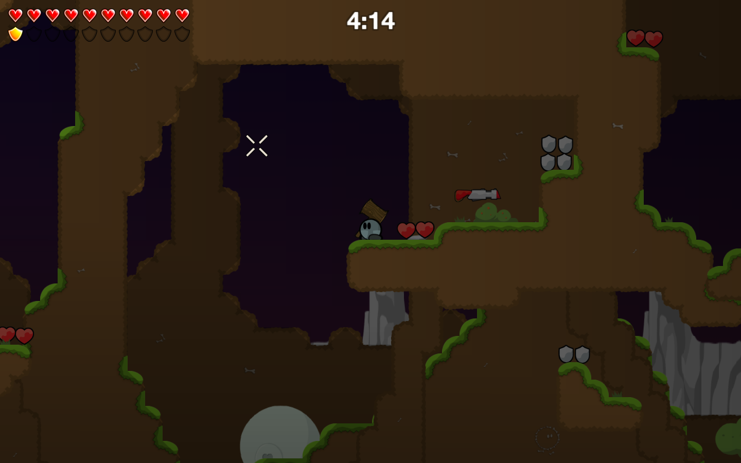
Tee_Shirt_Caverns.map
This map kills processors, but with detail turned off you only see the basics. 
hey nice thats even better 
but all this layers are a litle bit confising :S
Its nice.
p.s.: I was read:
Tee_Shit_Caverns.map xD XD XD XD
sry but your map sucks=(
Its nice.
p.s.: I was read:
Tee_Shit_Caverns.map xD XD XD XD
Me too 
I'll test the map, it looks TOO awesome.
...
AHHHH MY COMPUTER CRACKS UP 
lol, I think maybe its too high detail >.<
I was somewhat worried that the layers may be too confusing. Later I will edit top layer so it doesn't have anything out too far in front of game layer, and possibly shade it. I will also shade back layers a lot more.
But for now there it is.
sry but your map sucks=(
Wow... I must say very constructive criticism. Here is a fork, go ahead and stab at your computer with it.
Here is a fork, go ahead and stab at your computer with it.
Tried that.
Didn't turn out well...
lol
looks really nice
gonna test it
Alive? Did you survive it? I mean your computer, did he survive?
Darki wrote:looks really nice
gonna test it
Alive? Did you survive it? I mean your computer, did he survive?
yay he survived xD
lol, I oughta make a less detailed version, but I am real lazy so it may be a while before I do.
Well its is a great idea and a great thing 
but it gets too dark after the day before the moon comes out 
Then i dont know where i can hook and where i cant xD
But it is a great feeling, i feel like in a 3D world!
This map... pwns so hard... o-0
Some of layering is unnecessary and confuses people as to what the actual ground/wall is. If you remove those layers, I am sure this map would be 2 x better. I think this should get TQ'd.  cheers
EDIT: I just played it on my server. IT IS AMAZING! However, due to some improper layering, I don't think it can be TQ'd just yet. You should make the solid layer the layer at the front. Other wise, it becomes very confusing.
thx now it look like a nice map xD
Ok here is what I am going to do, I am going to keep the layer in front of the game layer there, I am just going to make it a square border. Possibly remove some of the doodads, and that is about it.
I like how it gets real dark when there is no source of light, Imma keep that.
Im not gonna post any screenshots cuz I am lazy, It will look just like the last one but few tweaks.
Im not quite sure what your mean by TQ'd though...
Tee_Shirt_Caverns.map
Awwww dude! You just unlocked a whole new style of mapping man! Oh BTW, this is TQ
Teeworlds Forum → Maps → [MAP] Caverns
Powered by PunBB, supported by Informer Technologies, Inc.
Currently installed 3 official extensions. Copyright © 2003–2009 PunBB.