Re: [TILESET] Japanese Temple [With Source Files] officially pimped
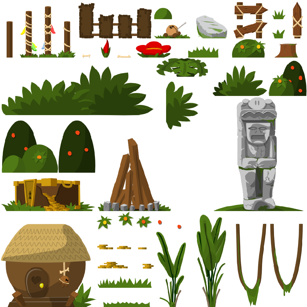
A new tileset means 80% old style and 20% new. Make sure it does not look like another tileset. Make sure people recognize the same style and elements, but give them a slightly different look. So if you make new trees, make sure the look is different, but keep the style. You want cherry blossoms - but they are too detailed. Look at the orange blossoms of the grass bushes. They are simple circles. Let's keep that idea and let's use circles for the blossoms, k?

It looks like a teeworlds tree, but it does look like one with lots of blossoms. It looks pretty much like yours, just with less details.
Regarding perspective ...
First of all, parallel perspective does not mean it has to be a full frontal view. All of your objects use a full frontal view. That's not that cool as it looks very flat (2D). If you rotate your object on the vertical axis you will get a more 3Dish look. e.g.

Regarding colors....
If you use inkscape have a look at your color scheme at the bottom. Reuse the same colors for the same materials e.g. I do not know why you chose a different blue for the roof of the tee house. Look at the lantern and the stone statue: several different gray tones.

Make a sketch how your theme should look like in general. A color scheme means that all the colors are in harmony. Ensure that background, midground and foreground are clearly distinguishable.
Besides, usually we have a blue version of doodads, if there is a red one. Maybe your "Asian" color scheme uses red as a standard color ... you decide ... then we won't need a blue one 
Regarding the zoom ...
Play a map with your tileset and tell me you see the details of every cherry blossom... RLY? Keep it simple. If you cannot really see the details, drop them. It's hard to understand at the beginning. All of us who are self-educated "artists" had some problems with this at the beginning. But trust me, it's good for everyone to drop the details.
Besides - I am the gfx guy!


 )
)


